Wednesday, December 7, 2011

Visual Techniques


Visual Techniques:

-Movement
-Contrast
-Depth
-Dimension
-Symbolism
-Representational
-Color
-Tone


Visual Techniques:
-Contrast
-Depth
-Dimension
-Representational
-Tone
-Color


Compare and Contrast:

          While Adele's and Taylor Swift's album covers use contrast in different ways, it is used in a way that compliments and is successful towards each album. Adele's 19 uses contrast to the extreme. There are very minimal colors, and in fact, the majority of the image is black. Taylor Swift's Speak Now uses contrast in a different way. The purple dress against the white letters creates a subtle contrast that works in all the right ways, making it so that the words "speak now" are easily read. Definition is given to both the words and the colors of the image. Both album covers also utilize depth and dimension. The shading on 19 illuminates the artist's face, making it real by adding depth, rather than having the picture be a flat image. The highlight on Adele's bangs also add dimension to the picture. Speak Now also utilizes depth and dimension through the motion of Swift's dress and the placement of the words on the image. The motion of the dress adds dimension because of the shading and depth given to the contours of the dress itself. Both albums are also very representational. They portray what the album stands for, and what it means to the artist as well as potential viewers. Swift's album has a sense of spontaneity, whereas Adele's album has a sense of sorrow and cautiousness. Both album covers also use tone and color. Adele's 19 does not use a lot of color and tone, but just enough to convey the message intended. Swift's Speak Now uses bold purple coloring of Swift's dress, as well as the bright red lipstick Swift is wearing. One can also spot the cat-eye eyeliner effect worn by Swift. The amount of color in Swift's album artwork adds to the element of spontaneity in the message conveyed. Both albums are very inspirational and personal to the artist, which allow the artist to therefore be personal with his or her audience. As a singer/songwriter who wants to design her own album artwork, these artists are very inspirational to me. They prove not only through their music, but also through their album artwork that being personal can lead to good things, and that you have to put yourself out there in order to get anywhere.


Sunday, November 27, 2011

Contrast

Successful:


          This image of Adele's debut album, 19, shows a successful design that includes the element of contrast. The image has a pitch black background and intense shading on the artist's face. The most visible parts of the image are that of one side of Adele's face, her bangs, and the album artist and title lettering. The image uses a lot of light and dark contrasting colors. The background and shading are completely black, as dark as they could be, and Adele's face is very fair, all the while maintaining the element of color. The lettering is also of high contrast. The "ADELE" lettering in the lower right hand corner of the image are extremely noticeable due to the fact that they are white and the background is black. The same can be said for the "19" with the exception of the coloring of the numbers being the same color as Adele's skin rather than pure white against a black background.


Unsuccessful:


           This image is of the album artwork for Orion, entitled Reborn. This image is a complete failure in terms of contrast. At a first glance, it would appear that the entire image consists of a blue background with a black, orange and blue teardrop in the top center section of the image. The background is blue, and Orion's shirt and pants are both blue. The entire image is the same color with the exception of Orion's hair, which has a nice contrast against the blue background. The mask Orion is wearing somewhat contrasts against his skin and hair. However, it is so close in proximity to the rest of the blue picture. This image was badly designed. This album would not catch anyone's eye and has no element of surprise or complexity. Even the artist's expression seems to be disappointed with the result of this bad design.

Thursday, November 10, 2011

Movement/Motion


          The Beatles' Abbey Road album cover implicates that motion is occurring (see above). The image is of four men walking across a street in a single-file line. In the distance behind them is a car traveling towards the men. Since the album is entitled Abbey Road, it is fitting that the men are walking across a street, assumed to be that of the actual Abbey Road. Movement is implied not only because of the positioning of the men walking across the street, but also because of the positioning of the car in the middle of the road coming towards them a distance away. It would not be normal to park all of the cars in such formations as in this picture and have the men pose as if they were walking across the street. Thus, motion must be occurring at the time the image was taken.


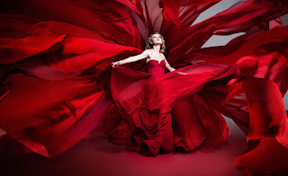
          Yet another image of Taylor Swift (this one for her website) implies that motion is occurring. The image is of Taylor Swift wearing a vibrant read gown with a burst of red fabric exploding from behind her, as she is the center of the image.  There are different tones of the red in her gown being shown in this image, although it is quite certain that the pieces of fabric flowing around her are not actually part of her dress. It would be an incredibly complex and difficult job to create a sculpture of the movement of the dress and fabric behind Swift. Thus, it is only natural that the fabric and Swift herself are in motion at the time this image was photographed.

Monday, November 7, 2011

Dimension, Depth, Space, and Scale


          This image is a fan-made version of Taylor Swift's Speak Now album artwork. The artist incorporated dimension, depth, space, and scale in to the design. The motion of Swift's dress conveys that the image has dimension rather than being a totally flat picture. The "Speak Now" placed in front of Swift adds depth to the image because of the fact that it was placed in front of her rather than above, below, or on either side of her.The contrast and lighting on Swift's skin also portrays depth and dimension. The water color stroke and paint splatter brushes used to create the background of this image use both the elements of space and scale. The darker brushes are spaced out evenly so that the photograph is not uneven, and the dark water color splatter underneath Swift was designed to look like an artistic shadow of her dress, thus incorporating the element of space. The sizes of the brushes that were used definitely incorporate scaling. Swift looks a bit smaller than some of the brushes used but larger than others. This gives the image a sort of abstract feel.

Wednesday, November 2, 2011

Tone and Color

   
            This image of Adele's sophomore album, 21, incorporates tone through the lighting within the photograph.  This is a black and white image that uses a lot of different tones to highlight and emphasize different parts of this photo. For example, her face and hand are colored in lighter shades of grey, whereas the majority of her hair and the background of the image colored in darker shades of grey and black. This relates to the element of contrast primarily since it is a greyscale image. This tragic, yet element photograph of Adele integrates contrast and tone through the lighting to create a strong tonal visual structure.


This image of the album artwork for Adele's debut album, 19, is very similar to that of the artwork for 21. The only difference, aside from the actual photo, is the fact that her debut album cover was a color photo rather than a greyscale image. However, both images have a very strong tonal visual structure and high levels of contrast. The color in this photo emphasizes Adele's hair and face, and the white and light beige lettering of the album artist and title are given attention through the contrast against the black background.

Wednesday, October 26, 2011

Album Artwork

The Basic Elements:


     Taylor Swift's third album, Speak Now, cover; movement:  This image incorporates movement not only through the direction Swift's dress is flowing or how her hair seems to be blowing in the wind, but also through the photoshopped paint splatters. Her dress seems to be moving from right to left, as one can tell by the angles of the spinning dress and through the shading. The purple paint splatters on the right side of the image denote that that they are moving away from Swift; as though the bottom of her dress was soaked with paint that splattered as she spun. It is clear that movement was incorporated in the design of this image as well as the result. The role it plays is Swift's idea of the spontaneity of 'speaking now' and no regrets in doing so.


      Taylor Swift's Speak Now CD design, line:  This image incorporates lines in its design and result. The six arms/hands put together the way they are in this image create a sort of asterisk shape. Each hand is directly linked to another hand, creating four different lines that all intersect in the middle (shown by the purple lines added to the photo for clarity). It's job is to create a unique, yet sophisticated CD cover that shows not only the unity of Taylor Swift and her band, but also the incorporation of bold lines that represent strength.


       Pink Floyd's Dark Side Of The Moon album artwork; shape:  This image of Pink Floyd's Dark Side Of The Moon album artwork illustrates how the design and result of this album cover used the element of shape to create a successful, recognizable image. The primary feature within the image is a triangular prism. The role of this triangular prism relates to the album title, Dark Side Of The Moon, by having light and vibrant colors on one side of the prism and a dull line connected to the dark side of the prism. It is clear that this ideation is concurrent in both the design and result of the album cover. This image also incorporates line and movement, as the singular ray of light (line) turns into a rainbow going in the direction of left to right (movement). 


Wednesday, October 19, 2011

Visual Thinking Research

Puzzle #1: The Cat

My roommate's attempt:
My roommate, Rebecca, chose to start with the most simple, noticeable triangles first, starting with the body, then the tail, and finally ending with the complexity of the head. This strategy is categorization because she chooses similarly shaped triangles and categorizes them based on complexity. Rebecca succeeded in counting all 18 triangles.


My attempt:
I chose a similar approach of categorization. However, I did not categorize based on level of complexity - I categorized by each body part of the cat in a directional matter. I started with bigger triangles in the head-shaped area, then moved to the smaller triangles. Then I traveled to the body of the cat, and again, I began with the big triangle and ended in smaller triangles. As I moved on to the tale, I followed the direction that the triangles were pointing until I reached the tip of the tale. I missed two triangles - I counted the two small triangles (per each eye) but did not count the larger triangles that they make.


Puzzle #2: The Squares


Rebecca's attempt:
Rebecca's strategy for solving this puzzle incorporated categorization. She started with the biggest square, then moved on to the center squares. As she was outlining the center squares, she saw that two of each side of the four small center squares made up half of a larger square. She successfully counted 11 squares.


My attempt:

My strategy for solving this puzzle also incorporated categorization. I started with the four squares along the outer edges (connected to the four center squares) and then moved on to count the smallest sized squares. I then counted the largest square and finally the large square that the four center squares make up. I successfully counted 11 squares.